Here you will find my most recent works. Several pieces are still in progress and will be added to this portfolio once they are finished.
This webpage was realised during my apprenticeship at Grand Est Automobiles.
The company wants to open a "customer loyalty space" on its website. The aim is to
enable customers to
check their loyalty card(s) and the related information, such as the available offers
and their usage history.
My mission was to design the mockups and to develop the page with a colleague (front
office and back office).
The data is dynamically retrieved and processed from the Grand Est Automobiles'
database.
Tools and languages: HTML, SASS, PHP Laravel, MySQL, PhpMyAdmin, Figma
Since this page is only accessible to the company's customers, the link below will
direct you to the official mockups
we made for this project.
This page was designed for the Grand Est Automobiles "loyalty" campaign as well.
It is intended for the employees in charge of the organisation and management
of the campaign. It consists of a dashboard where one can rapidly check several data regarding the loyalty
cards for all 28 car dealerships.
I was in charge of the complete realisation of this project: I was able to determine
the relevant data and graphics that would appear on this dashboard, design the
mockups and
develop the entire page. The dashboard contains various data, including a curve showing the traffic on
the customer
webpage, a feed notifying recently created cards, an alert for soon-to-expire cards,
and the number
of times an offer has been used per month.
Tools and languages: HTML, SASS, PHP Laravel, Chart.js, MySQL, PhpMyAdmin, Figma
This dashboard is reserved for GEA's employees. Therefore, it is not possible for anyone outside the company
to visit it. However, you can have a look at the official mockups on the link below.
As part of my first year project, I was in charge - with a group of four other students -
of redesigning the website of the association Alsace Réseau Neutre.
We designed the mockups in respect with the
graphic charter, needs, and requests of the association.
The most difficult component to rethink was undoubtedly the header: in the first version
of the website, some menus were composed of more than fifteen sub-menus.
We therefore had to redo the entire site arborescence to obtain a menu that can
reference this great amount of pages in a clear and intuitive way.
Feel free to see the old verison of the website
, as well as the new one
, done with Grav CMS.
The association is still developping more webpages on its own, because these pages were not
in our official production specification document and therefore not part of our internship.
The pages we made are those with a matching mockup on this Figma, do not hesitate to visit it too.
To get better at coding, there is no such thing as creating your own website without the help of a CMS! So I set myself the goal of drawing each illustration and code each page by hand (HTML5, CSS3, JS, PHP). Two months later, my site was ready to make its appearance on the web.
As part of my research for an apprenticeship, I was asked to create a modern and professional fictitious (and therefore not indexed) one-page website for a barrister specialised in divorce in Strasbourg. I developped this website with WordPress (Divi Builder), and wrote all of its content from scratch, putting SEO as a top priority. The background image comes from a royalty-free image bank, and the little drawings were made by me. This work was done in three days, without any prior knowledge of family law. This allowed me to realise that I'm able to adapt quickly to subjects that are new to me.
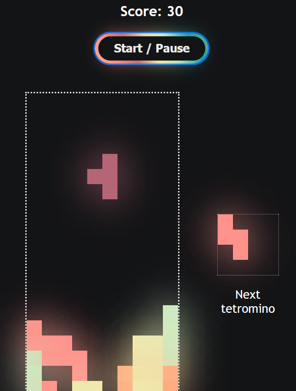
For all the Tetris nostalgics! This game was designed using HTML, CSS and JavaScript. My goal was to push my use of JavaScript further than the few functions necessary to animate a website. Learning to code video games is not necessarily one of my future goals, but this exercise allowed me to discover many methods that are specific to ES12. The pages in this section are only viewable on a computer screen; unfortunately, they are not responsive to different format.
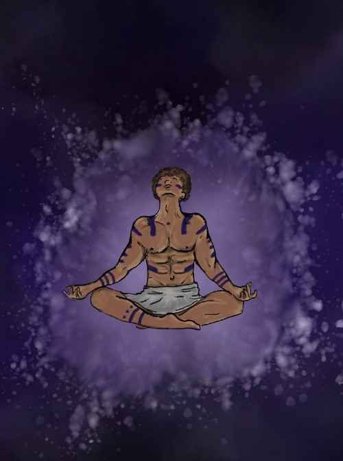
I was curious to see what can be achieved by mixing scripts and graphic design tools, I'm currently designing several scenes with HTML, CSS, JavaScript, Illustrator and Fresco (More coming soon!). The pages in this section are only viewable on a computer screen; unfortunately, they are not responsive.
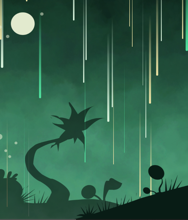
I was curious to see what can be achieved by mixing lines of code and graphic design tools, I'm currently designing several scenes with HTML, CSS, JavaScript, Illustrator and Fresco (More coming soon!). The pages in this section are only viewable on a computer screen; unfortunately, they are not responsive.
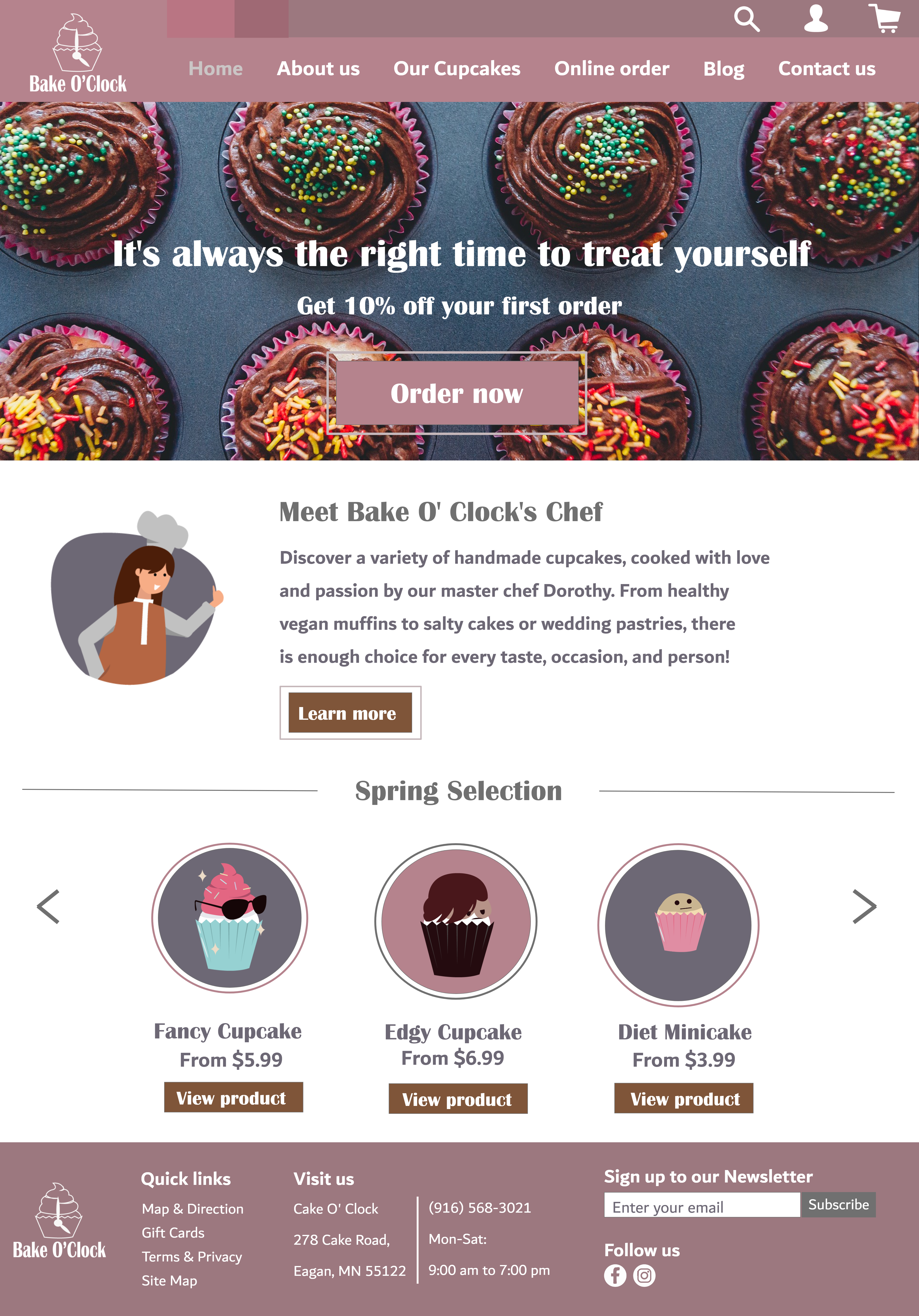
Homepage mock-up for a fictitious shop - Made with Adobe XD.
Bake O' Clock is a shop selling original cupcakes, which seeks to expand its customer
base
through its website. They are selling their cakes online and own a blog where they share
recipes and articles about baking.
Regarding the users, it is possible for them to create an account (the icon in the
header), make purchases online, consult the catalogue ("Our Cupcakes"),
or subscribe to the newsletter (footer). Information about the shop is put forward on
the home page, with the "learn more" button leading to the "About us" page.
But the main objective is to have a high conversion rate. Therefore, the CTAs inciting
to place an order are more present than the others.
Visually speaking, the website retains the "cute" dimension of the cupcake shops
universe, while maintaining a certain seriousness.
The typography, colour palette and designs have been chosen with this in mind.
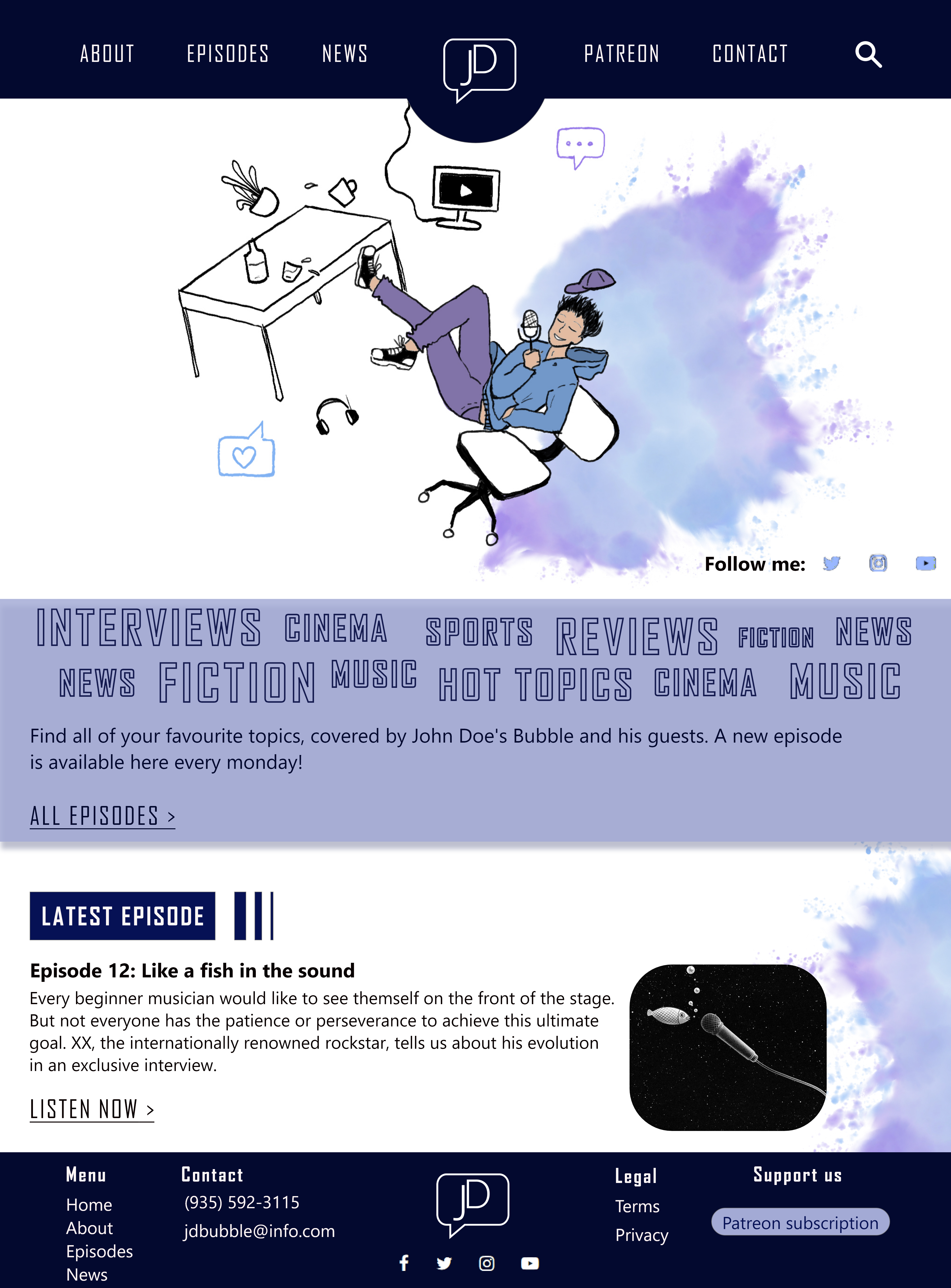
Home page mock-up for a podcast series - Made on Adobe XD.
John Doe is an entertainer who produces podcasts with his team.
John Doe's Bubble hosts a radio show and now wants to make their recordings available on
the Internet.
With this site, the team can now list its episodes and get support from the visitors
(Patreon subscriptions).
To extend its online presence, the team has also joined various social networks. The
links to the accounts are put forward in the body of the page and also in the footer (as
a CTA).
As for the graphic aspect, the site is mostly white and dark blue, with a few touches of
purple to nuance it.
Blue, especially dark blue, inspires confidence, reliability, and calm, and is therefore
a key colour in communication.
Secondly, the light banner highlights the different themes of the podcasts in order to
draw attention and curiosity to them.
The homepage also presents the latest available episode with a shortcut to listen to it
in one click.
fermer
×fermer
×fermer
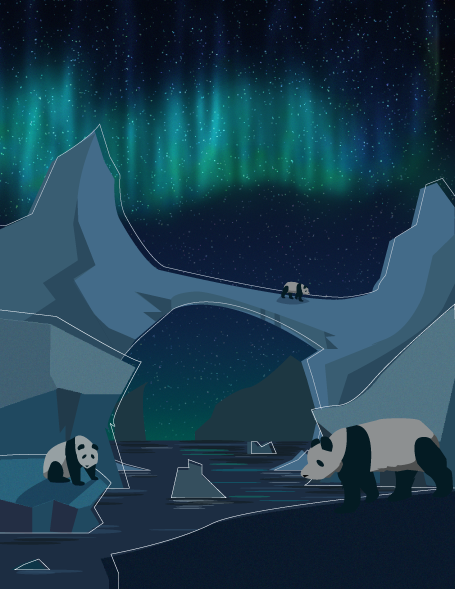
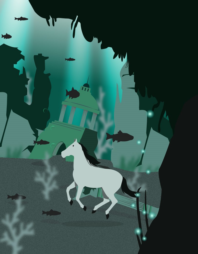
×This series of three images - made on Illustrator - has a rather simple concept: animals lost in the wrong environment.
This series of three images - made on Illustrator - has a rather simple concept: animals lost in the wrong environment.
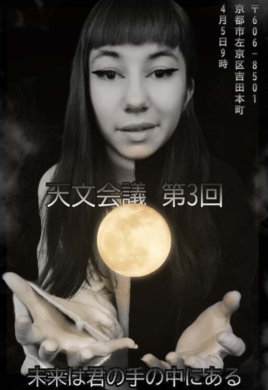
Poster for a fictitious event, designed with Photoshop. The event I chose is a fictitious convention on the future of astronomy taking place in Kyoto. I wanted to work mainly on the visual aspect; the placement of the pieces of information, colours and light, as well as typography. The glow effect and the moon draw the eyes to the centre of the poster, where the name of the event is located. A slogan is placed at the bottom, with a (bitmap) effect on the typography to make it stand out from the other blocks of text. Finally, the practical pieces of information, i.e. the address and date, are placed in the upper right-hand corner, and written vertically, as the Japanese language allows. This difference is intended to show that not all blocks serve the same purpose in this poster.
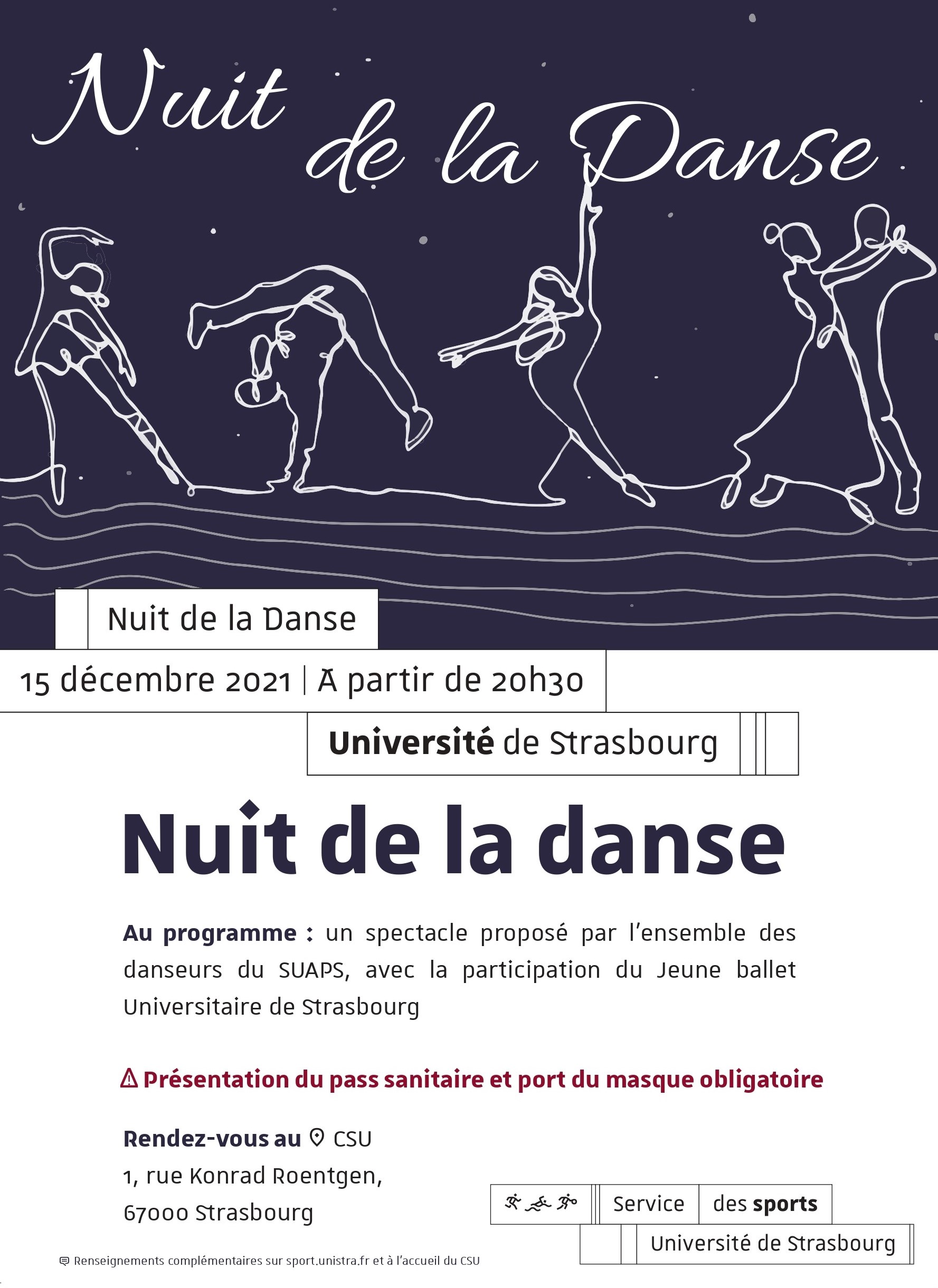
This poster was made on InDesign and Illustrator, for the "Night of Dance" - an event organised each year by the sports department of the University of Strasbourg. During this event, each dance club of the sports department presented a choreography. The dance styles were therefore varied, but united in a single show. This is what I wanted to represent by staging different dancers linked by a single guideline, which also represents movement. Finally, the graphic charter of the university has been carefully respected for the layout and typography.
This artwork was made on Illustrator, for the communication campaign of the masters of my faculty. It illustrates an article that was published on the TCLoc master's blog. The article is about similarities between translation and technical communication (read the article). The master's graphic charter specifies that characters and other elements should be drawn in a simple way, without too many details. So, I focused on the two main themes of the article, representing them as speech bubbles that can communicate with each other and be used together by the same person during their project.
Close
×Close
×Close
×Close
×Close
×Close
×I drew this mini-universe using Mental Canvas Draw, an application that allows its users to create scenes on several levels of depth, and to travel through the drawings as desired (using spatial strokes, 3D navigation, and free-form animation).
During this year's English class, each student was asked to make a podcast or video on a topic of their choice. I saw this as an opportunity to practice using Adobe Premiere Pro software. I'm not yet able to create fully 2D animated videos with smooth animations, but it's a skill I'm trying to develop thanks to this type of small project. My drawings were made on Adobe Fresco.
My very first animated video! Made on Photoshop and Premiere Pro for the GALA association's international Rising Star competition. As this piece of work is above all a presentation, I decided to keep the visuals simple. This way, my video illustrates my important points without distracting the audience from what is being said.